Story NAVI NGUYEN
Photos INTERNET
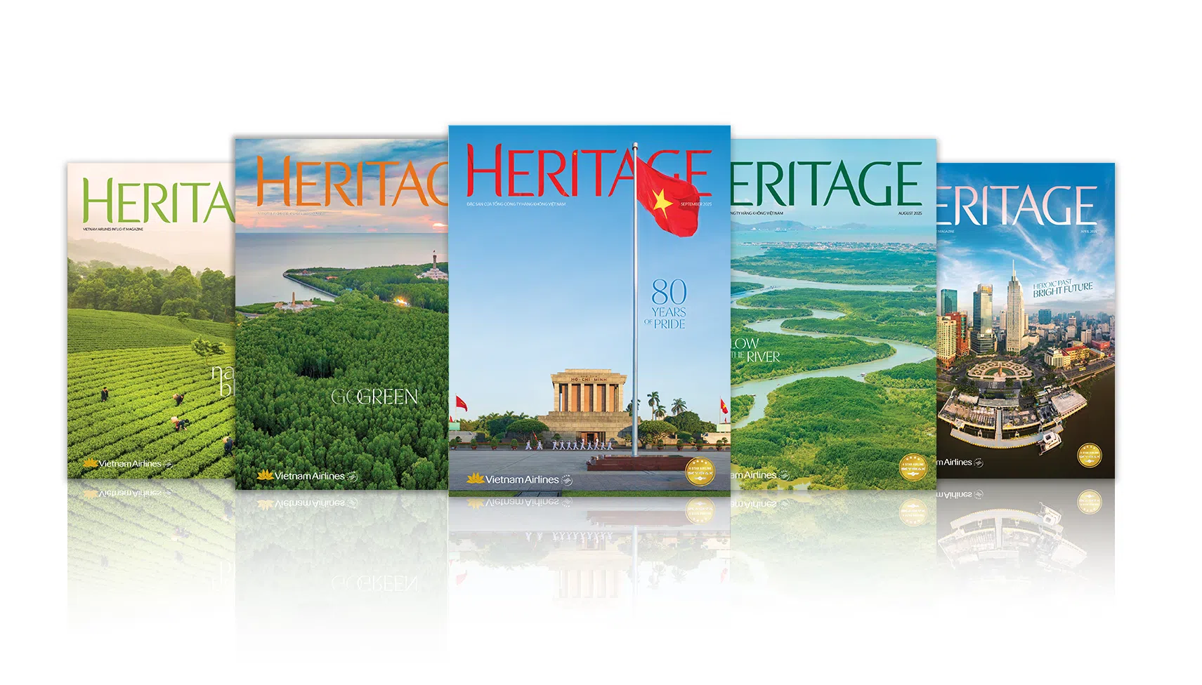
As the publishing industry evolves, magazines in both print and digital formats still focus on making a strong visual impression.

Redesigning perspectives
Throughout publishing R history, many magazines make a vital first impression with their cover model choice. The cover personality must embody the publication’s spirit, be a current topic, or have made a significant societal mark. For example, Glamour magazine, which focuses on the lives of Hollywood stars, chose actress Ann Sheridan for its inaugural cover in 1939. A similar approach was taken with musician Madonna for the first issue of Spin magazine and actress Mia Farrow on the cover of People in 1974. The cover creates the first impression when readers encounter the magazine, guiding their perspective as they turn the pages inside.
The publishing industry has long recognized the influence of magazine covers on the masses, with some images becoming iconic or sparking heated debates. Consider the collaboration between editor Harold Hayes and art director George Lois, who created controversial covers for Esquire magazine for over a decade. In 1969, Hayes and his team invited artist Andy Warhol to “drown” in his own giant Campbell’s soup can. The cover’s meaning was both a satire and celebration of the absurdity of fame. Andy Warhol had built his reputation with Campbell’s soup can paintings, becoming the face of pop art, yet his fame also consumed him. This demonstrates how a cover can serve as a statement.

In the digital age, many major publications have moved online. Yet, the cover remains a cultural declaration, a dialogue, and a social sentiment. Magazines are redesigning their images in a more minimalist way, reducing promotional headlines and striving to convey identity and representation in popular culture. Even with social media democratizing content distribution, appearing on a magazine cover remains a significant career milestone for many celebrities.
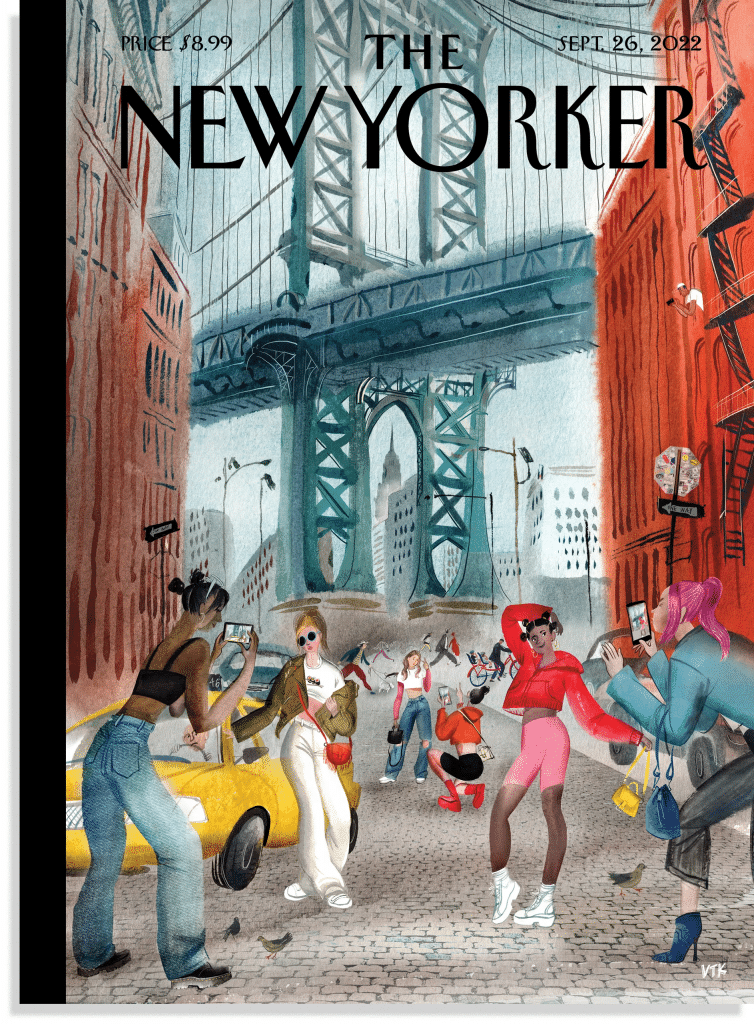
Speaking of inspiration, creators cannot overlook the covers of The New Yorker. Long home to some of America’s top reporting, essays and fiction, the magazine’s covers captivate with visually striking and colorful illustrations. Over its long history, many artists, animators, and graphic designers have left their mark on the covers. This artistic quality has led to the creation of spin-off versions in various cities.
Redesigning reading
While the cover is like an inviting door, the magazine’s layout is the interior that makes readers want to linger. Screens may replace paper, and the physical world is becoming digitized, but the rules of publication design remain essential. The layout of images and text creates a harmonious visual impact, allowing writers and designers to collaborate in constructing meaning and messages for article content. When the publication is released, readers perceive the article as a cohesive whole.
If a magazine page lacks aesthetic design, readers may miss out on all or a portion of an article’s content. Today, many businesses are inviting designers to restructure their images rather than relying solely on ready-made templates online. These designers can disregard established aesthetic conventions while still balancing overall page elements and considering factors such as image composition, text, white space, color effects and paper texture.

Designers create appropriate layouts based on the magazine’s content. For Eye magazine, which delves into the world of graphic design and visual culture, text and images are divided into easily readable sections with spaces left for readers to avoid feeling overwhelmed by information. Japan’s Idea magazine amazes readers with its typography design. It observes various creative contexts within the country and internationally to celebrate the beauty of words.
Today, different formats for magazines open up new possibilities for interacting with readers. The digital world has created synergy between text and images with multimedia elements like sound, video and animation. Ultimately, making an impression through compelling design is still an essential way for a publication to stand out in our current information-saturated world.


